
Stockholm-based furniture company Massproductions launches a new visual identity developed by Figur. The idea behind the identity is based on the company name and highlights repetitive patterns and movements, that can often be found in industrial production.
Stockholm-based furniture company Massproductions launches a new visual identity developed by design studio Figur. The idea behind the identity is based on the company name and highlights repetitive patterns and movements, that can often be found in industrial production.
February 1 – 2022
Written by Sanna Fehrman
“As a furniture producer you have an endless number of applications where a strong and functional graphic identity is needed. Our new graphic identity draws inspiration from industrial processes, repetitive motions and modernism in a bold and playful way. Figur have done an absolute brilliant job in interpreting the essence of Massproductions” says Magnus Elebäck, CEO and CO-Founder of Massproductions.
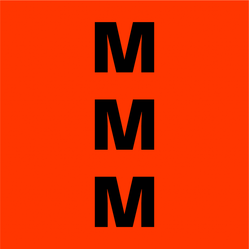
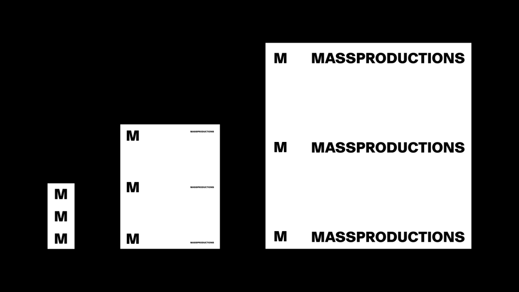
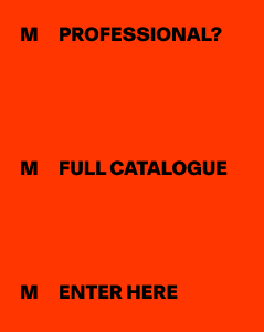
Central to Massproductions identity is system that refers to known industrial processes. Content stems from an M in a repetitive manner to mimic a production line. The design system is flexible in nature and scales to any given format using a fixed margin.
Figur and Massproductions wanted to explore a color spectrum that is often found in industries. Massproductions new primary colour palette includes the signifying M Red, which is seen as an integral part of the brand identity.
” I have the feeling that the colour red have been avoided lately. The saying “If you can’t make it good, make it big. If you can’t make it big, make it red” couldn’t be more wrong. The red is obviously an interesting signal colour used for functions in industry and machinery. What excites me is also that we’re entering some sacred ground treaded by designers such as Vignelli and Müller-Brockmann. ” Says Magnus Elebäck, CEO and CO-Founder of Massproductions
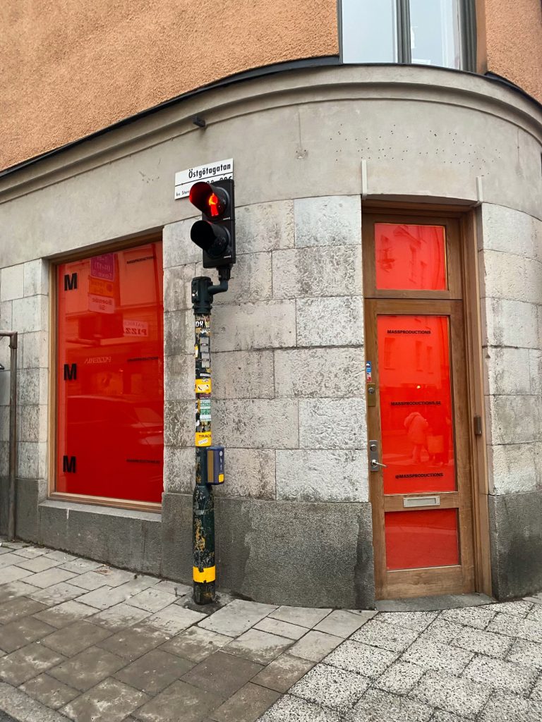
In connection with the launch of the new identity and Stockholm Design Week, Massproductions pop-up Works will open on Östgötagatan 29, on Södermalm in Stockholm. At Works, the new identity is embodied in an exhibition created by the architectural studio Specifik Generic.
”Massproductions came to us with a need to organize their visual toolbox. The outcome became the M-system; a play with the art of repetition. We created a visual identity that repeats itself to manifest the beauty of efficient industrial production, with the paradox that each application we make is anything but repetitious since the M-system adapts to any given format. Thus, we can structure information, play with hierarchy, create motion patterns, and make room for magic in-between” says Lukas Nässil and Dennis Friberg, founders of Figur.
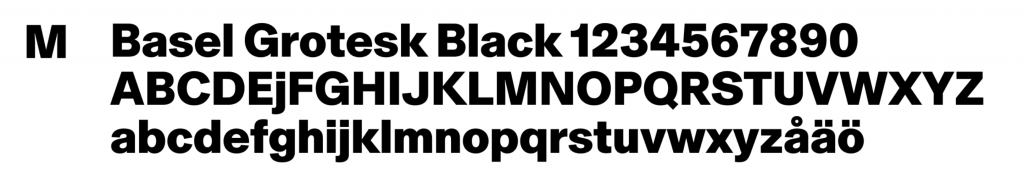
Massproductions’ typography is Basel Grotesk, created by the Swiss type foundry Optimo. Rooted in modernist typography, Basel Grotesque reinterprets key elements of this aesthetic with a new dynamism. It features characteristics that bring steadiness to both the new logotype and written content.
Loading...
By logging in, you agree to our Terms and conditions, Privacy policy and Cookie policy.
Your cart is empty.
You can see how this popup was set up in our step-by-step guide: https://wppopupmaker.com/guides/auto-opening-announcement-popups/